
New PQ logo, and a lookalike
The Parti québécois launched its new logo on the weekend:

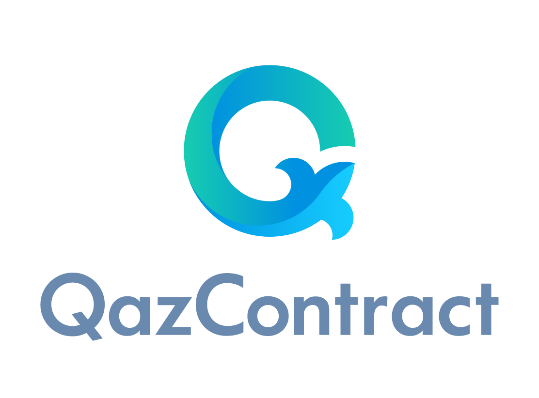
A marketing guy called Jean-François Proulx found essentially the same logo on a Kazakh site:
Admittedly, when designing a logo, you usually do some research first, and Kazakhstan is pretty far away…
jeather 15:15 on 2021-12-07 Permalink
Are we assuming they just stole the design (or, more likely, hired someone who did)? It’s awfully similar. It’s not a bad logo, though.
DavidH 15:17 on 2021-12-07 Permalink
It’s biting its own tail and going in circles? Yep, great logo for the PQ.
Kate 15:47 on 2021-12-07 Permalink
jeather, when a designer is asked to come up with ideas, one of the sites they’ll skim for ideas is Behance.
Voilà.
jeather 15:56 on 2021-12-07 Permalink
As a not-designer, how would you a designer have come across it on Behance when looking to make a PQ logo? (I know nothing about this.)
mare 16:42 on 2021-12-07 Permalink
What the f*ck does Kazachstan with OUR fleur de lis! They don’t even speak French. Cultural appropriation, give it back.
(Still think it’s an ouroboros.)
Kate 16:56 on 2021-12-07 Permalink
jeather, the PQ isn’t rolling in cash, but they would’ve contracted with an agency. One of the first steps for something like this is to turn a few designers loose to look for ideas, and one of the first things they’d have searched for would’ve been Q-based logos. There are pages with Q logo ideas all over them in a file in that agency – that’s a certainty. Then somebody liked this one, they adapted it (getting rid of that 3D swirly effect, shame) and adopted it.
There are very few new ideas in the world, though. It’s just possible someone dreamed this idea up separately and spontaneously. If someone says to you “Make a logo that has to merge a Q and a fleur-de-lys” how many ways can you put it together?
jeather 18:10 on 2021-12-07 Permalink
So that is a . . . yes they stole the design? (Hired someone who etc.)
Kate 20:33 on 2021-12-07 Permalink
Well, as I say, design can experience convergent evolution, but these are awfully close. I’d say it’s 90% likely they stole the design, but most design is stolen.
thomas 04:51 on 2021-12-08 Permalink
The proportions of the new design seem wrong to me — where the fleur-de-lys seems oddly asymmetrical. Also, wasn’t the original PQ design inspired by El Lissitzky’s “Red Wedge” poster?
Mitchell 06:58 on 2021-12-08 Permalink
Before I read the post, I thought it was the placeholder icon for Quicktime player.
maggie rose 08:40 on 2021-12-08 Permalink
It just doesn’t look like une fleur in this configuration. More anatomical or zoological, less botanical.
Ian 09:23 on 2021-12-08 Permalink
Cute concept, but it looks like a G.
In any case I guess the PQ doesn’t know about right click > search Google for Image
Kevin 11:21 on 2021-12-08 Permalink
It’s sadly typical of the PQ that the party’s attempt at a relaunch/rebranding only gets attention because of their logo.
But it shouldn’t be a surprise, because the past six decades have demonstrated that their core argument “we need separation in order to do X” has failed as Quebecers proved time and time again that X can be accomplished without separation.